Visual identity for Aurum Latvija
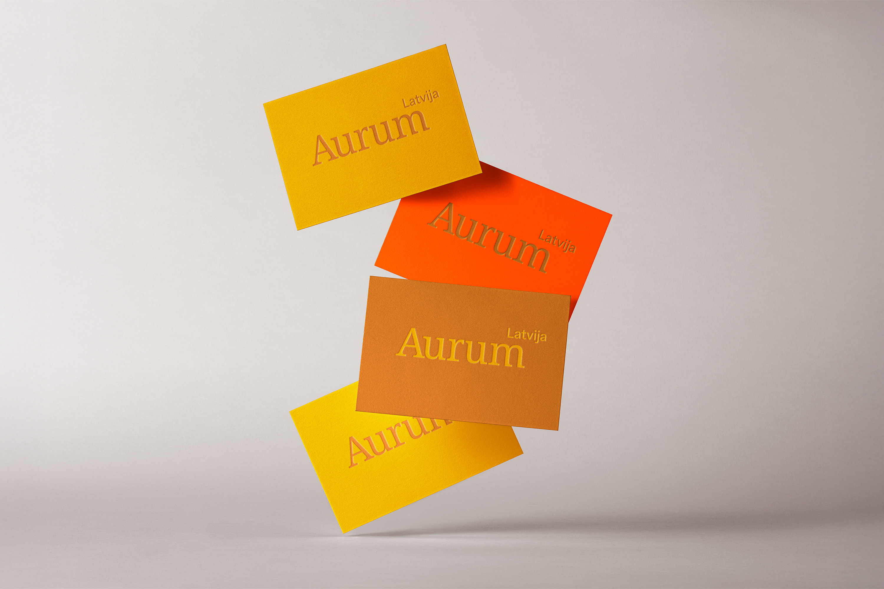
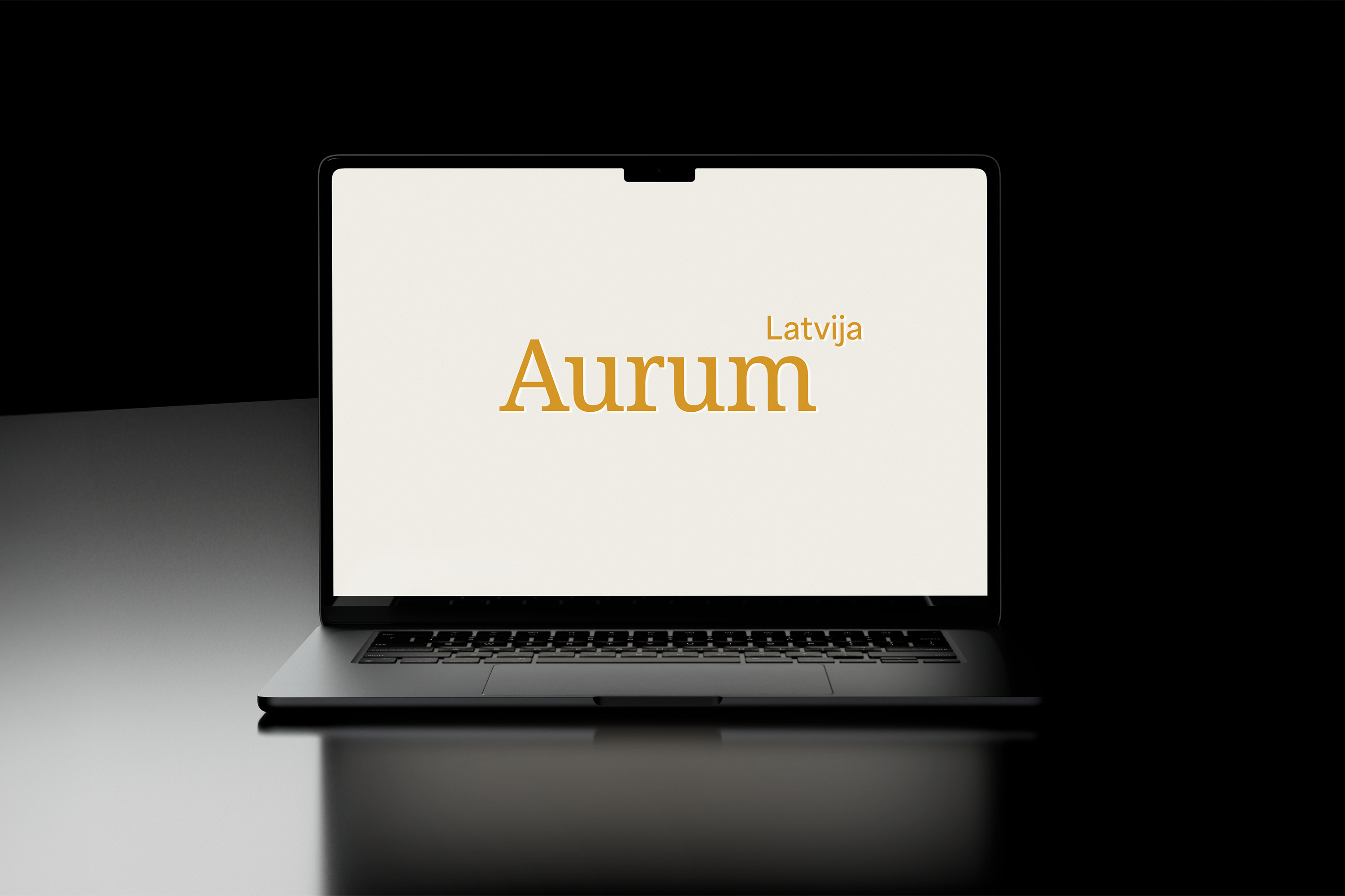
The name Aurum is derived from Ancient Greek, signifying the goddess of the golden dawn, who cast hues of yellow and gold across the sky during sunrise and sunset. Within the Aurum graphic mark, serif typography forms a precise and harmonious composition – a unified system in which every element is meticulously positioned with respect to optical proportions and spacing.
The result is a unified, balanced, and visually stable whole that reflects a sense of order and a structured aesthetic, designed to support the accomplishment of the organisation’s goals.