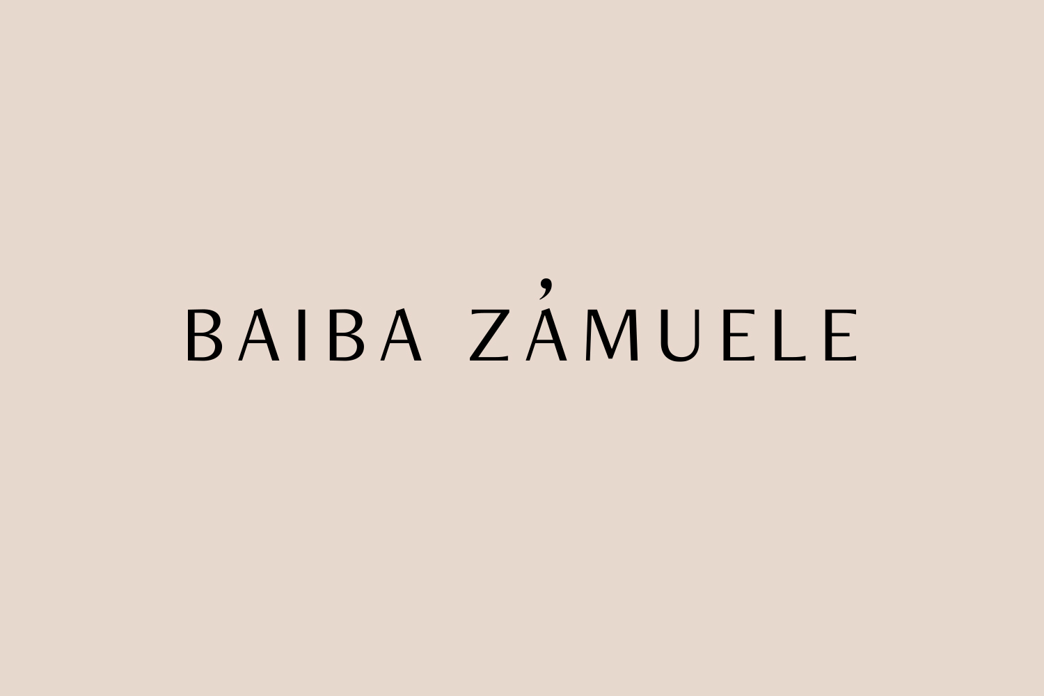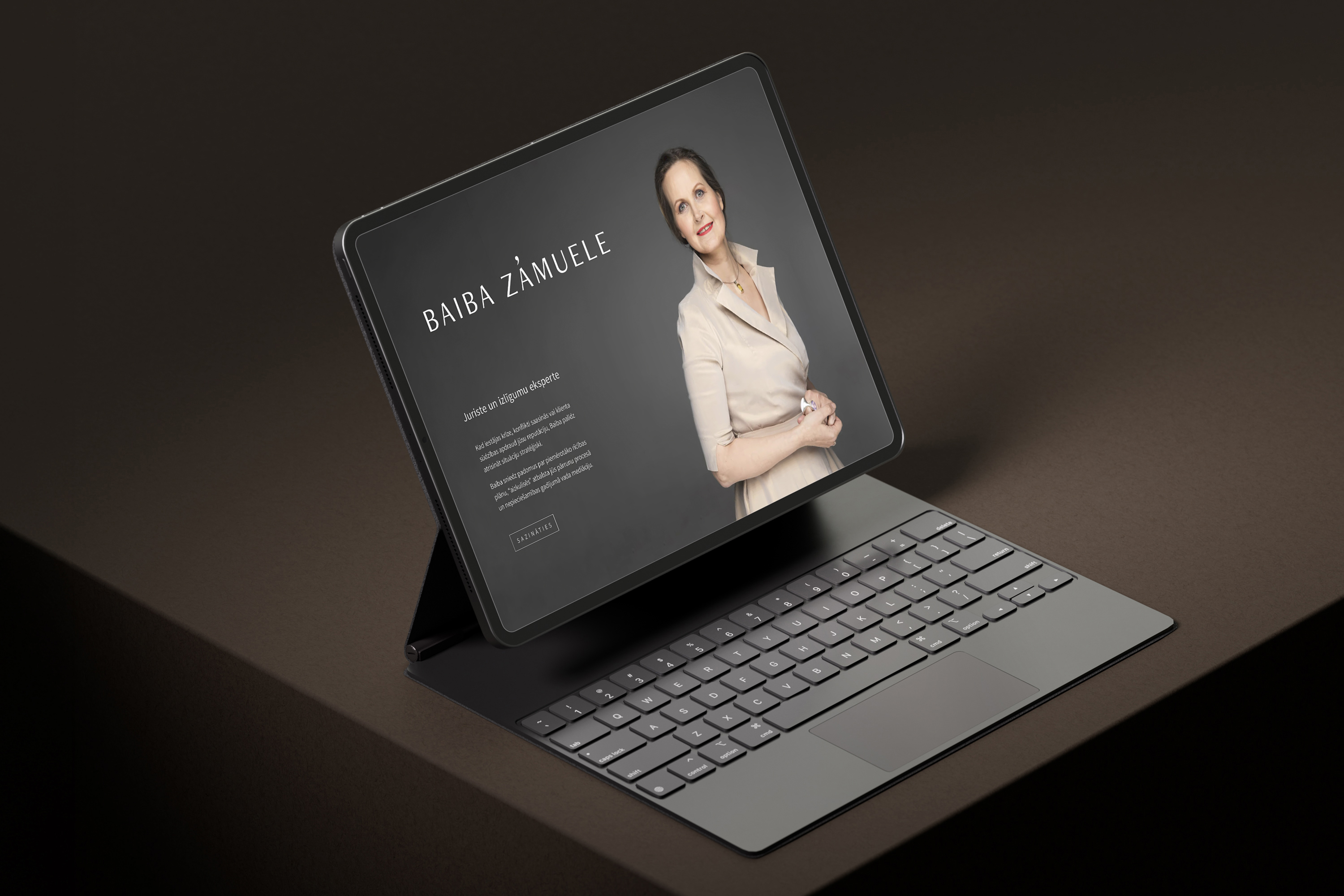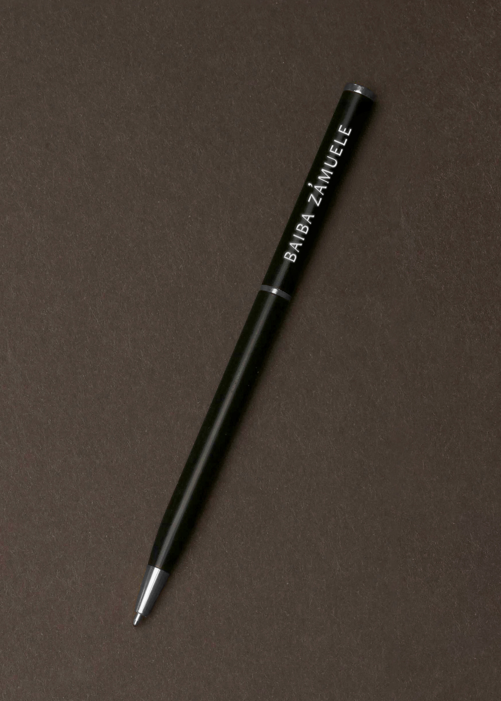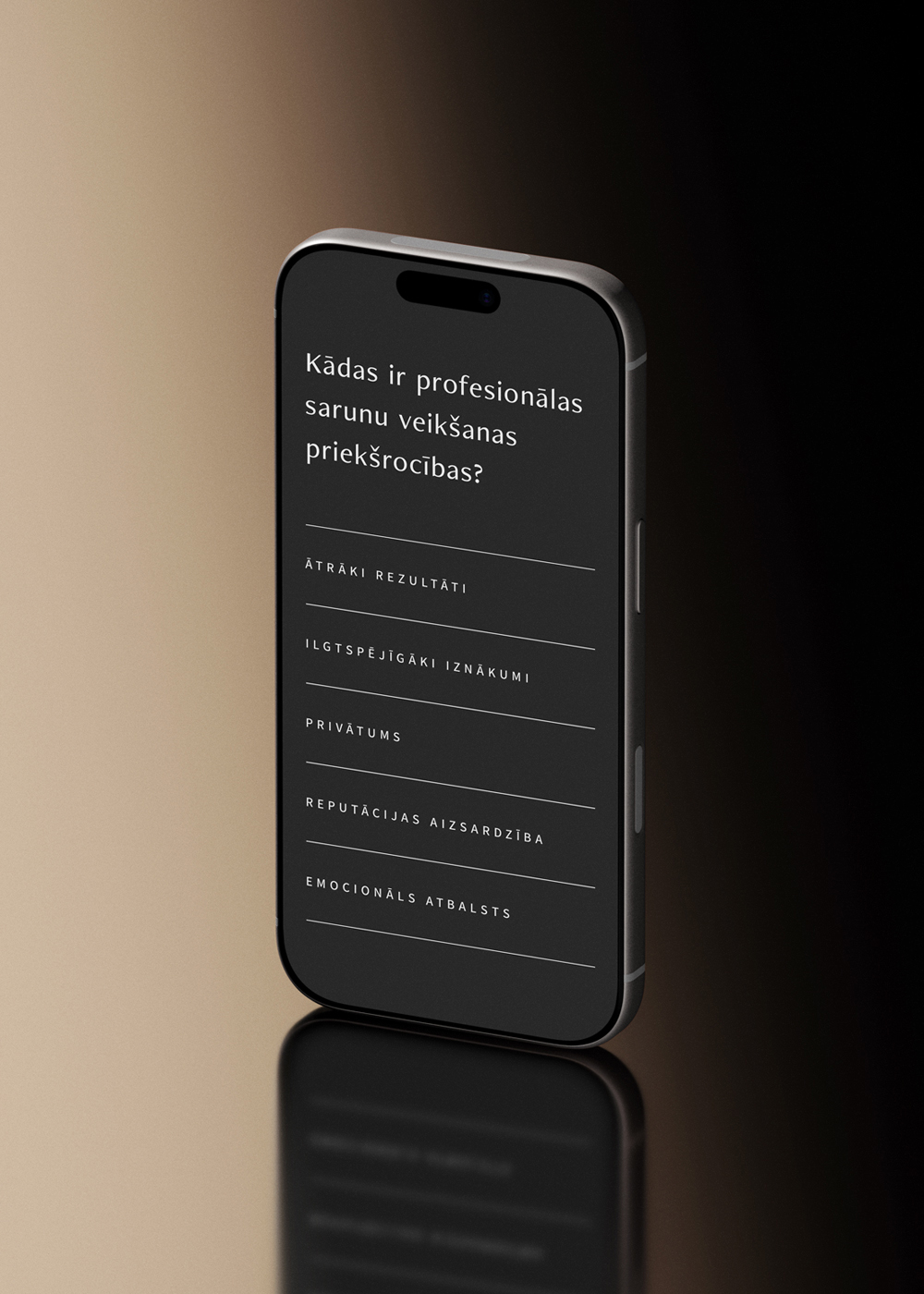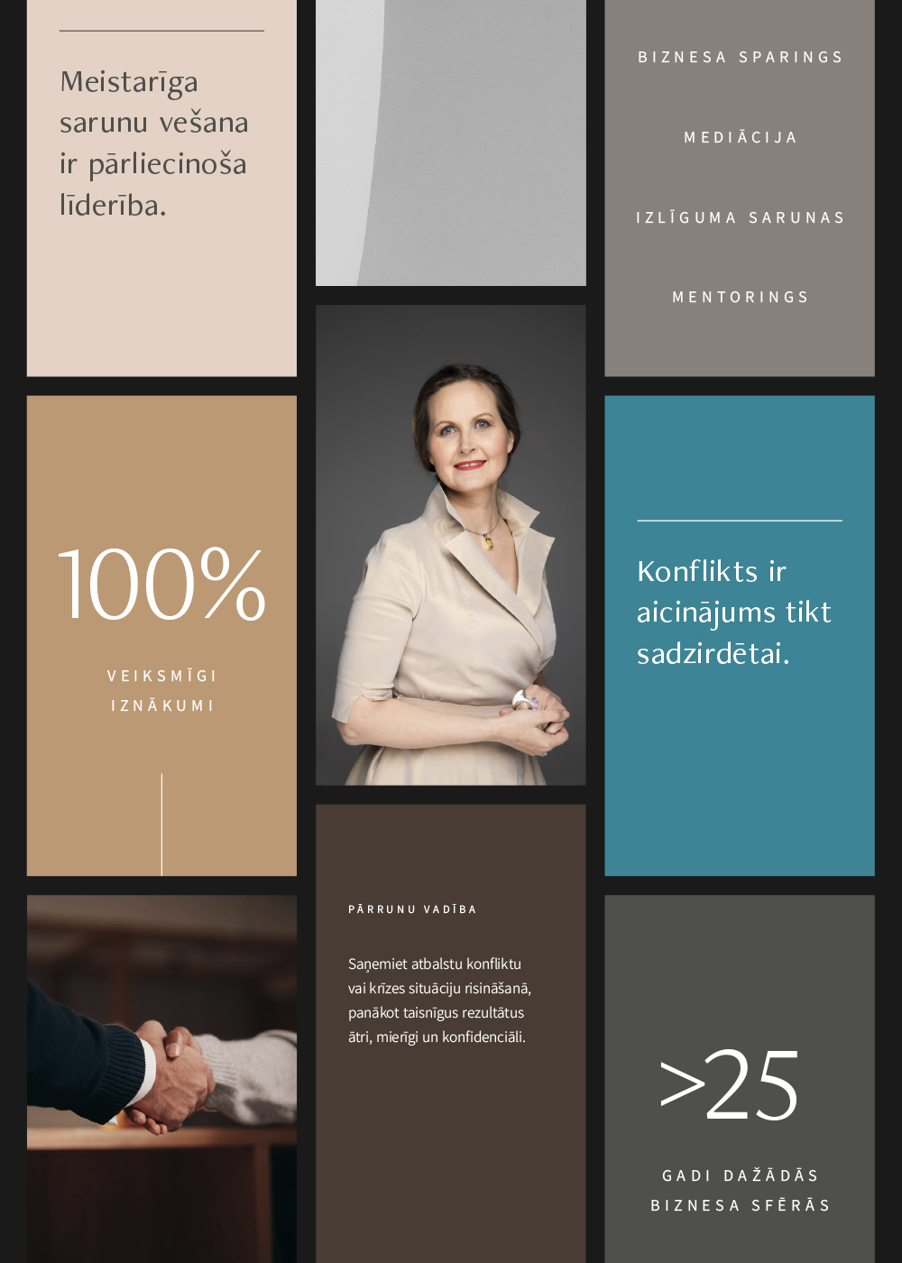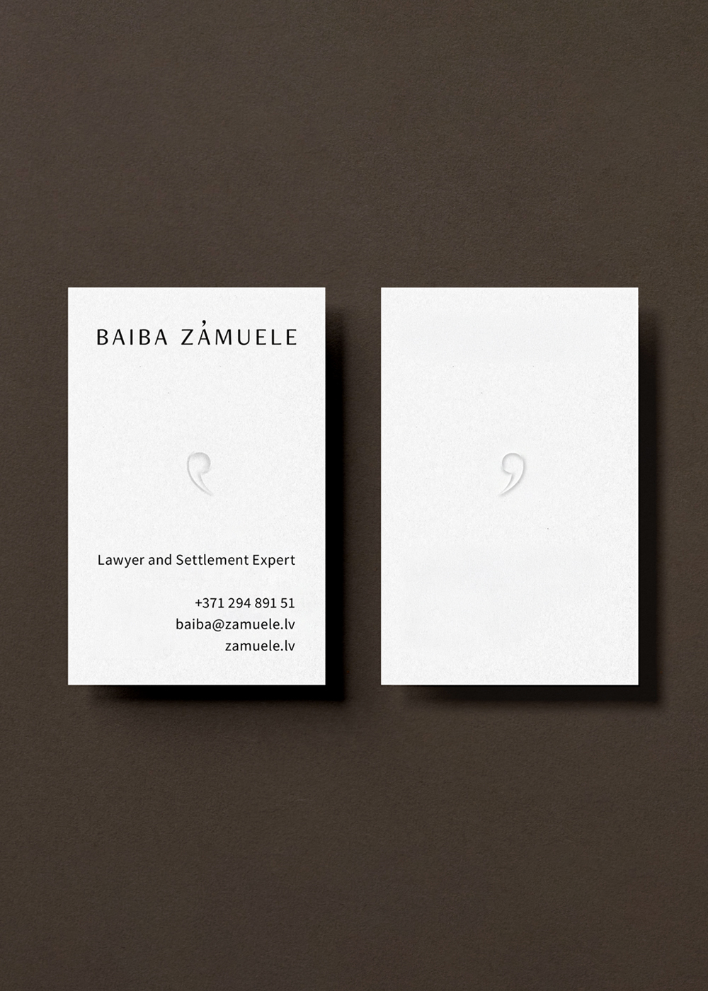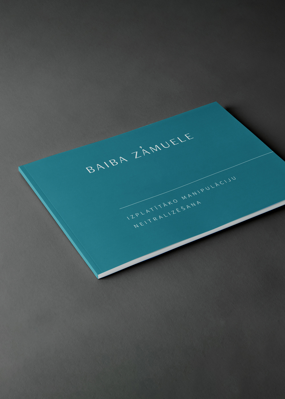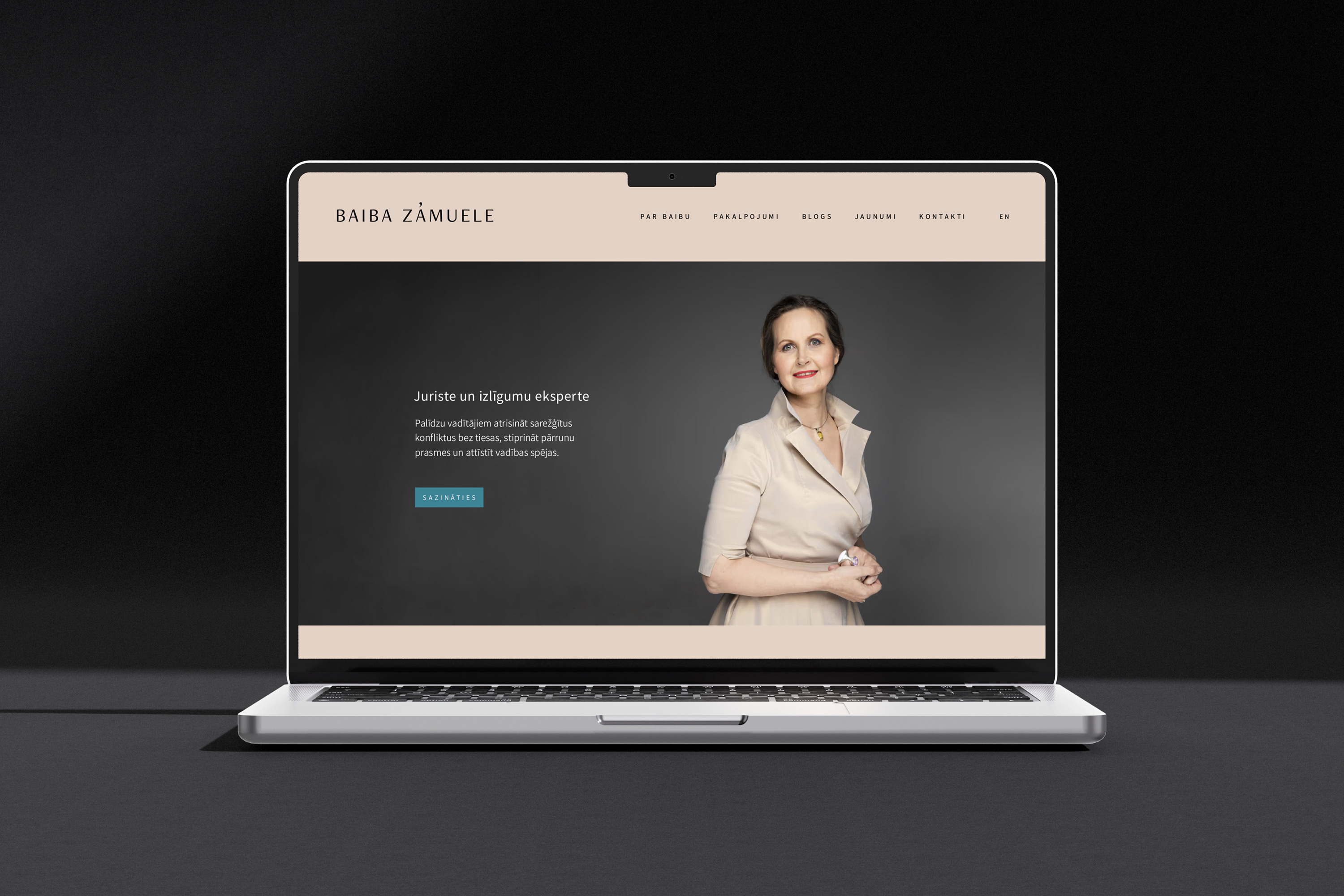
Baiba Zāmuele is a well-known Latvian lawyer and mediation expert. Therefore the core of the visual identity centres on a wordmark featuring her full name alongside her portrait. The macron over the letter “A” in the wordmark is designed as a breath mark (the musical notation indicating a pause for breath). This signifies the key to successful negotiation: the need to pause during any dialogue, reflect upon and understand what has been said, and articulate one’s response as effectively as possible.
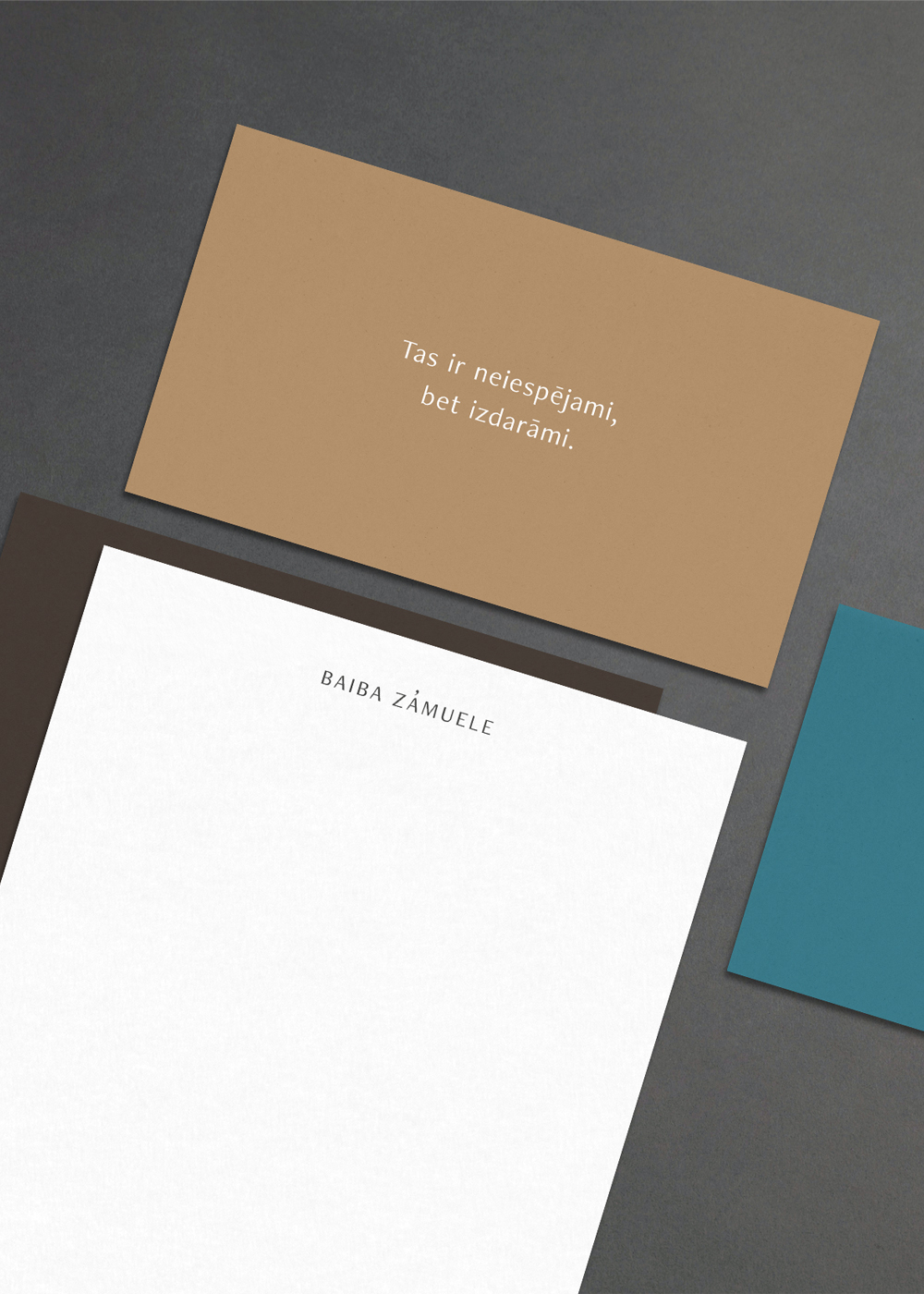
The laconic line work in graphic materials helps structure and emphasise information, echoing the crisp, well-defined forms of the wordmark. The colour palette is professional and composed (featuring various shades of brown), whilst also reflecting an individual approach to each client (a blue-green accent tone).
The overall brand identity is minimal and structured, created for a goal-oriented and experienced professional. The essence is expressed through subtle details: uncoated, crisp white paper paired with discreet but deliberate and well-considered graphic elements.